Giovanni Delle Donne
I'm a UX Designer

Let me Design your website | mobile apps.

Let me Code your website.

I am a passionate UX designer and front-end developer with expertise in creating intuitive and visually appealing user interfaces. I specialize in designing seamless user experiences and bringing them to life with clean, efficient code. Whether I'm crafting wireframes, prototypes, or developing responsive websites, I focus on user needs and modern design trends to deliver high-quality digital products.

See my Skills clear_all

2020
school
Web Design Fundamentals
Janets School
Studied the basics of web design, including HTML and CSS, focusing on creating and styling web pages and understanding foundational design principles.
2021
stylus
Graphic and Digital Design Certification
Bradstone Allington
Gained a certification in Graphic and Digital Design, learning advanced design techniques and tools, and started a work experience position at Market Me Digital.
2021-2022
work
Work Experience - Junior Designer
Market Me Digital
Worked for a year at Market Me Digital, gaining hands-on experience in graphic and digital design, collaborating on various projects, and contributing to digital marketing campaigns.
2022
devices
Google UX Design Certification
Coursera
Completed the Google UX Design Professional Certificate, enhancing my skills in user research, wireframing, prototyping, and usability testing.

Verify Me verified_user

2023
code
Freelance UX Designer
Self-Employed
Started working as a freelance UX designer, delivering user-centric designs for web and mobile applications, using tools like Figma, Adobe XD, and front-end technologies like HTML, CSS, and JavaScript.
css
CSS
Proficient in CSS for creating visually appealing and responsive web designs.
html
HTML
Expert in HTML, structuring content for web applications with best practices.
design_services
UX Design
Skilled in UX design, focusing on user-centered design principles and practices.
brush
Adobe Illustrator
Proficient in Adobe Illustrator for creating vector graphics and illustrations.
photo
Adobe Photoshop
Skilled in Adobe Photoshop for image editing and graphic design.
javascript
JavaScript
Currently learning JavaScript to enhance interactivity and functionality in web applications.
cover Porject
#1
Immigrants & Political Engagement
This project aims to create an accessible platform for first-generation immigrants to stay informed about proposed bills that impact their families, enhancing their engagement and advocacy in the political process.
#2
Fitness Studio Mobile App (Case Study)
A mobile application designed for a fitness studio, enabling users to schedule and book classes, track their fitness progress, and connect with other members for a comprehensive fitness experience.

#3
Charity Website (Case Study)
The Big Heart Foundation Webpage Redesign involved creating a user-friendly, mobile-responsive donation webpage to enhance global support for vulnerable communities. The outcome was an intuitive site that clearly communicates the foundation’s goals and streamlines the donation process.
#4
Sigth and Smile (Landing Page)
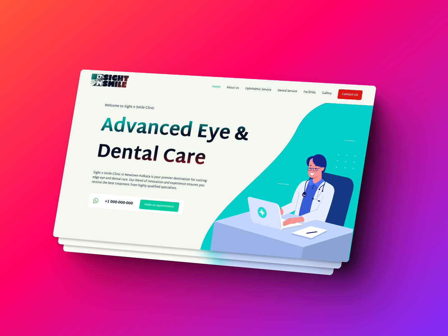
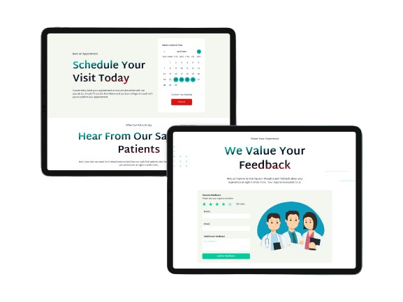
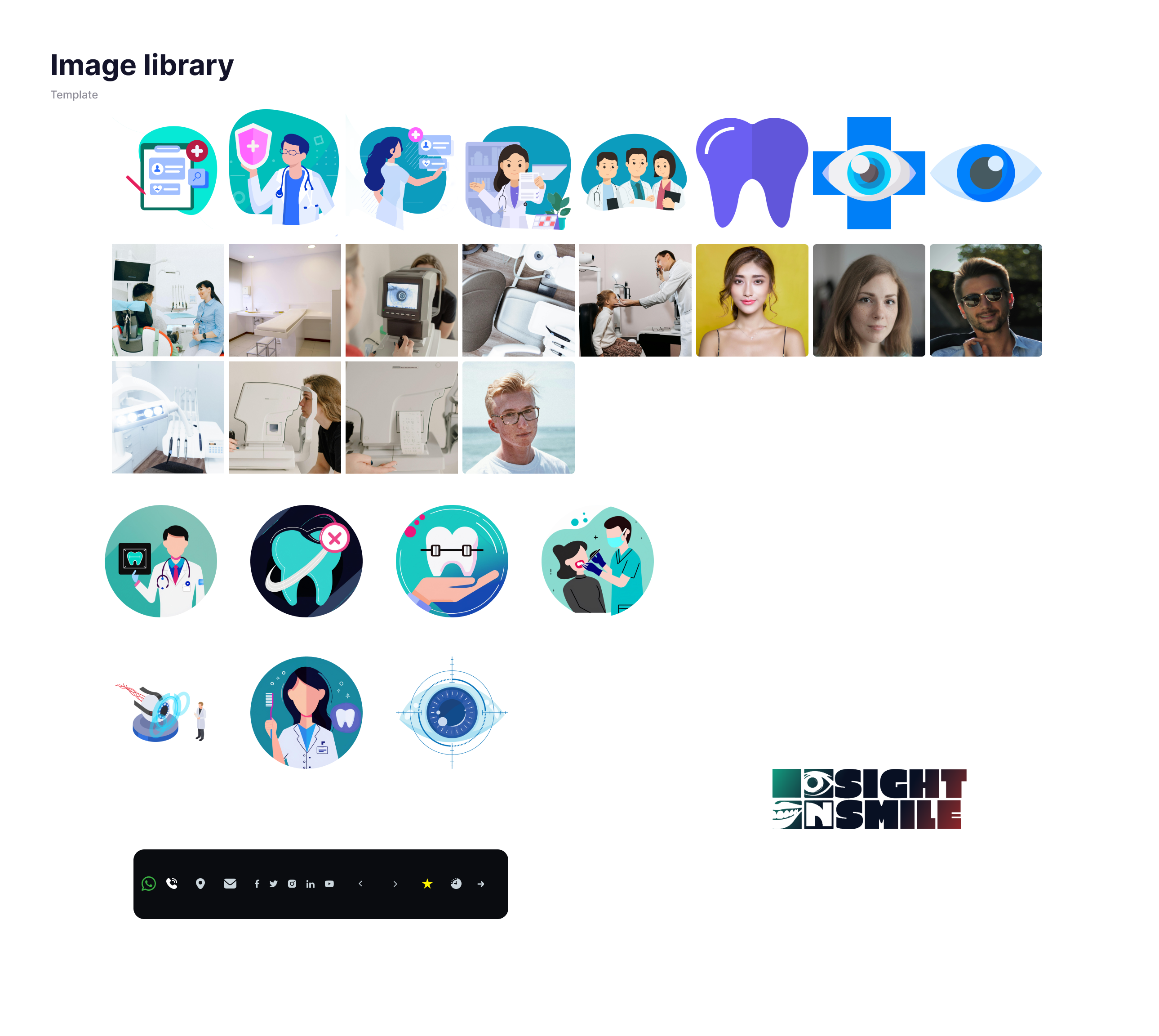
Sight n Smile Clinic is an advanced multispecialty eye and dental care center located in Newtown, Kolkata. Combining innovation with experience, the clinic aims to offer top-notch medical services in both ophthalmology and dentistry. This project focuses on creating a user-friendly and comprehensive website to showcase the clinic’s services, facilitate patient interaction, and enhance the clinic’s online presence.
#5
Rival Sports Gym Pain and Rehab
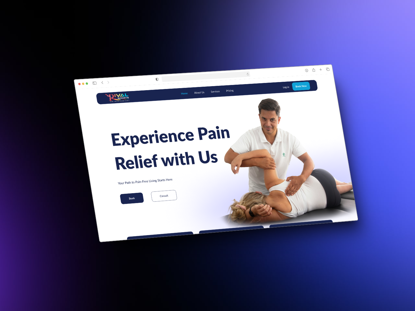
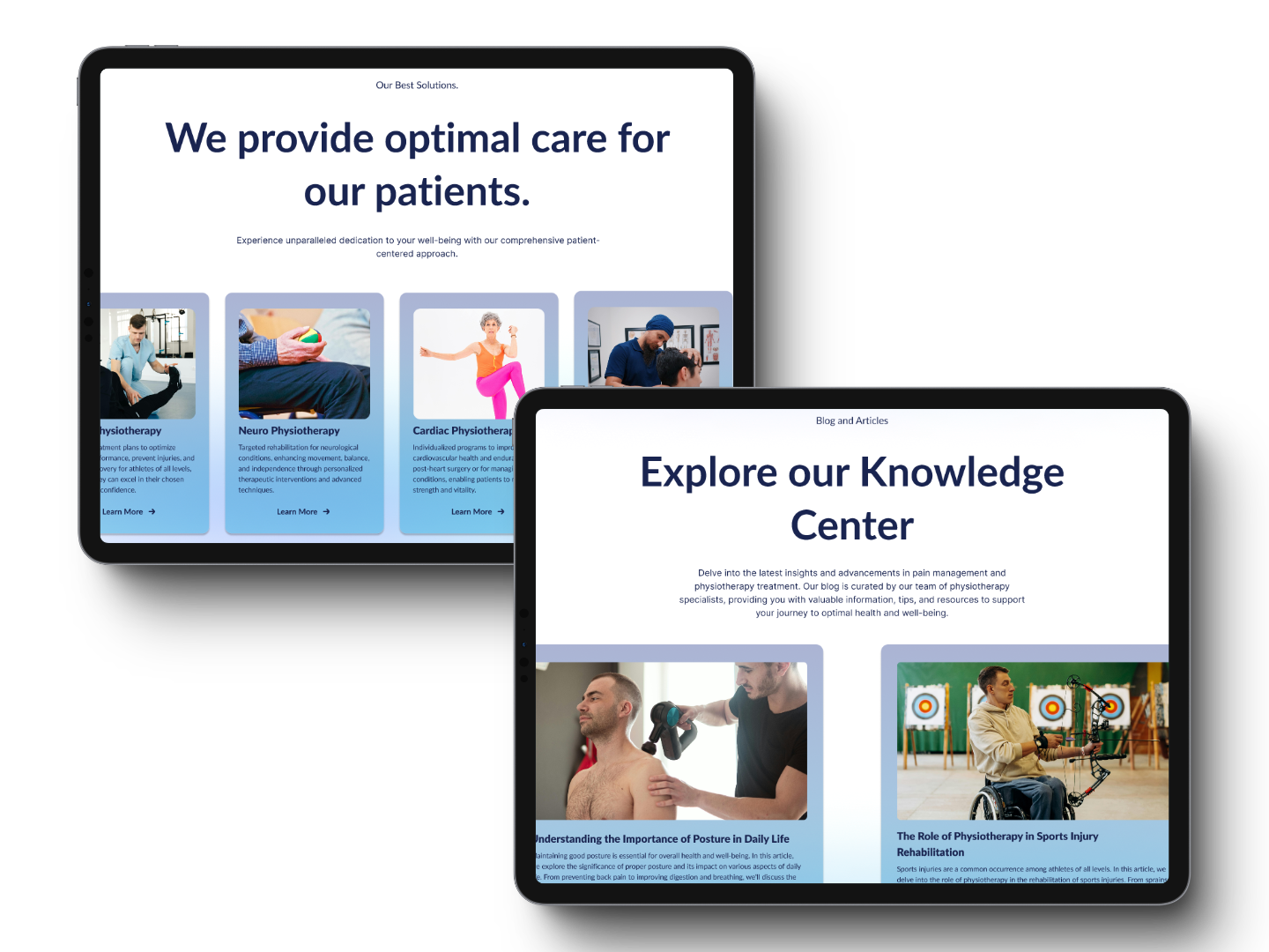
Created a modern, user-friendly landing page for Rival Sports Gym Pain and Rehab to showcase their new rehabilitation services. Conducted UX research to align the design with target audience needs, focusing on intuitive navigation and accessibility. The project included wireframing, prototyping, and UX copywriting, resulting in an engaging site that effectively communicated the company's services while enhancing the user experience.
Thank you!
Your message is important to us, and we’re thrilled to have the opportunity to connect with you.I’ll be in touch shortly to discuss how we can collaborate to bring your vision to life. In the meantime, feel free to explore my portfolio for a glimpse into the transformative design solutions I provide. Let’s create something extraordinary together!

See My Intro


contract Empowering Immigrants through Accessible Political Engagement

contract Project Overview

The target users for your product are first-generation immigrants who may be less familiar with the political system and may have difficulty navigating the often complex language used in proposed bills. By creating a user experience that is easy to use and understand, I've created a product that can help these users stay informed and engaged with the political process, which is critical for ensuring that their voices are heard.

brightness_alert The Problem

First-generation immigrants may struggle to understand the complex language and processes involved in proposed bills that may affect their families. This can leave them feeling disempowered and disengaged from the political process, making it difficult for them to advocate for themselves and their communities.

award_star The Goal

The design solution is to create a user experience that helps first-generation immigrants stay informed about proposed bills that may affect their families. By creating a user-friendly and accessible platform, I try to empowering these users to stay engaged with the political process and advocate for their needs. This user experience include features such as search functionality, filters, and notifications, making it easy for users to find information about bills that are relevant to them. This platform also increase political engagement and promoting civic participation among first-generation immigrants.

assignment_ind My role

  • Conducted research.
  • Defined user requirements and developed a user-friendly interface for the product.
  • Designed and developed the user experience
  • Conducted user testing.
  • Design a clear and accessible interface for complex political information on Mobile app and responsive website.
  • Demonstrated a strong commitment to delivering a high-quality product that meets the needs of the target users.

task_alt Responsabilities

  • Conducting research to better understand the needs of first generation immigrants in relation to political engagement and advocacy.
  • Developing user requirements based on the research findings and user feedback.
  • Designing the user experience for the product, including creating wireframes and prototypes.
  • Developing key features such as search functionality, filters, and notifications to help users stay informed about relevant bills.
  • Conducting user testing to gather feedback and improve the design of the product.
  • Iteratively refining the design based on user feedback and testing results.
  • Ensuring that the final product is accessible to a wide range of users, including those with disabilities or limited English proficiency.

person_search User Research:

Summary

For this project, I conducted user research to better understand the needs of first-generation immigrants in relation to political engagement and advocacy. My research included both qualitative and quantitative methods, such as interviews, surveys, and focus groups. Going into the research, I had some assumptions about the challenges that first-generation immigrants face when trying to understand proposed bills that may affect their families. However, through my research, I discovered that the language and complexity of these bills can be overwhelming and intimidating for many users. This led me to focus on creating a user experience that is as simple and accessible as possible, with features such as search functionality, filters, and notifications to help users stay informed about relevant bills. Overall, my user research was critical in shaping my understanding of the problem and developing an effective solution that meets the needs of the target users.

Pain points

Language Barrier

Many first-generation immigrants may not be fluent in English, making it difficult for them to understand the language used in proposed bills and other political materials.

Complexity of Political Information

Even for those who are fluent in English, the complexity of political information can be overwhelming and confusing, making it hard for users to stay informed and engaged.

Lack of Information Access

Many first-generation immigrants may not have access to the same information sources as other citizens, such as mainstream media outlets, which can make it dfficlt for them to stay informed about political issues.

Limited knowledge of political systems

For some users, their lack of knowledge about the political systems in the United States may be a barrier to effective engagement and advocacy. They may not know how to navigate the system or understand the impact of proposed bills on their families and communities.

assignment_ind User Persona

Mohammed Ali is a recent immigrant to the UK who works as an Uber driver. He wants to stay informed about proposed bills that could impact his community and take action to support immigrant rights. The app or website should offer curated news and summaries to help him stay informed without feeling overwhelmed. Mohammed wants to quickly understand how he can take action to support his community, and the app or website should offer resources and information about local community groups, events, and petitions. Finally, he wants to track the impact of his actions and stay updated on any changes to the legislative process. The user journey highlights the importance of creating a user experience that empowers users to take action and support their community.

User Persona
User Persona

Ahmed Hassan is a recent immigrant from Yemen working as a chef in the UK. He needs a way to stay informed about proposed bills that could impact his family's rights and protect them. The app or website should provide curated news and resources in an accessible format for users with limited English language skills. Ahmed wants to understand how he can take action to protect his family and engage with the political system. The user journey highlights the importance of creating a user experience that provides access to reliable information and resources for immigrant communities.

Maria Hernandez is a Mexican immigrant living in the UK with limited English language skills. She wants to stay informed about proposed bills that could impact her family's rights. The app or website should offer features that make the language more accessible and filters to narrow down the search results. Maria wants to take action to protect her family's rights by advocating for or against proposed bills. The app or website should offer resources and information about how to effectively engage with the political system. Finally, Maria wants to stay up-to-date on proposed bills and any changes to the legislative process. The user journey highlights the importance of creating an accessible user experience that empowers users to engage with the political process and advocate for their family's rights.

User Persona

web Site Map

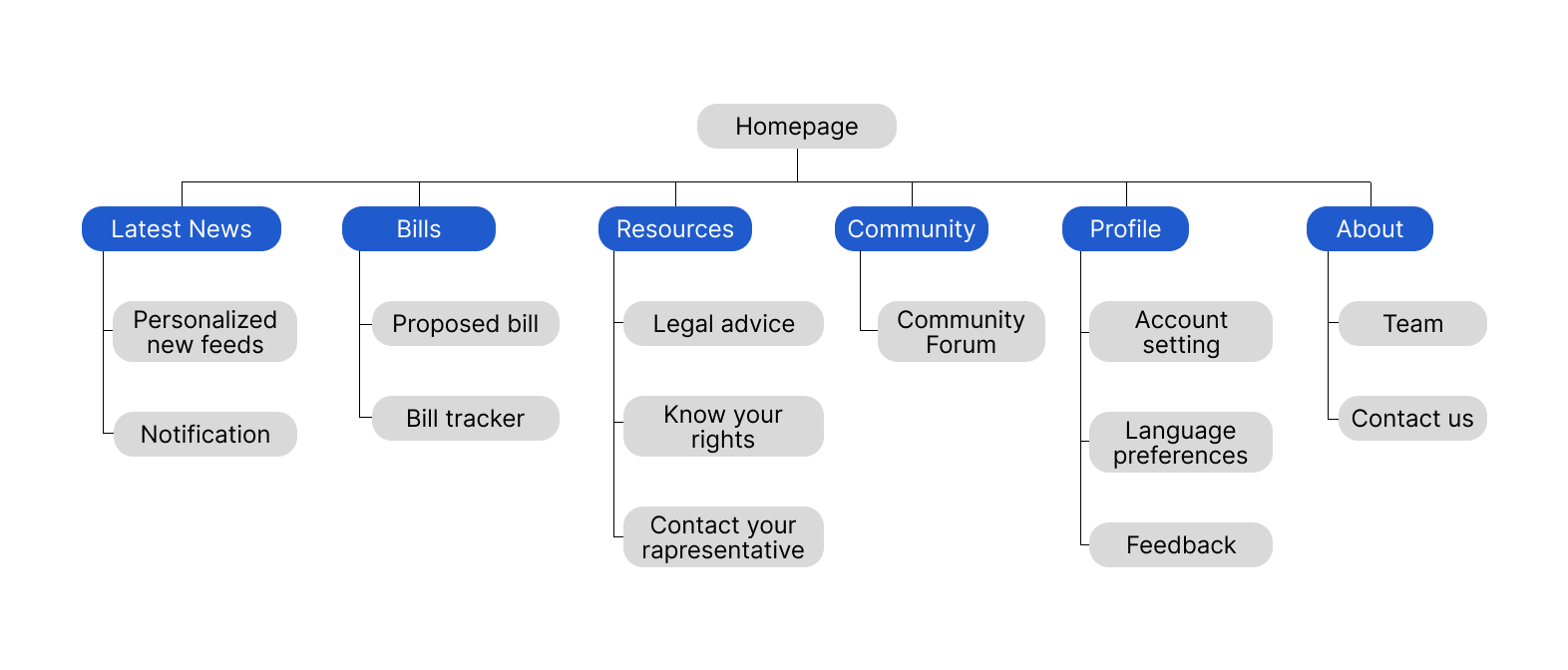
The site map is organized into four main sections: Home, Bill Database, Resources and Support, and About Us. Each section serves a specific purpose, providing users with information and tools to stay informed about proposed bills affecting immigrant families. The Home page provides an overview and latest updates, the Bill Database has comprehensive information about proposed bills, the Resources and Support section provides practical tools and information, and the About Us section has contact information and a brief overview of the website's mission and team members.

Site map

draw Scketches and Wireframes

Paper Wireframes

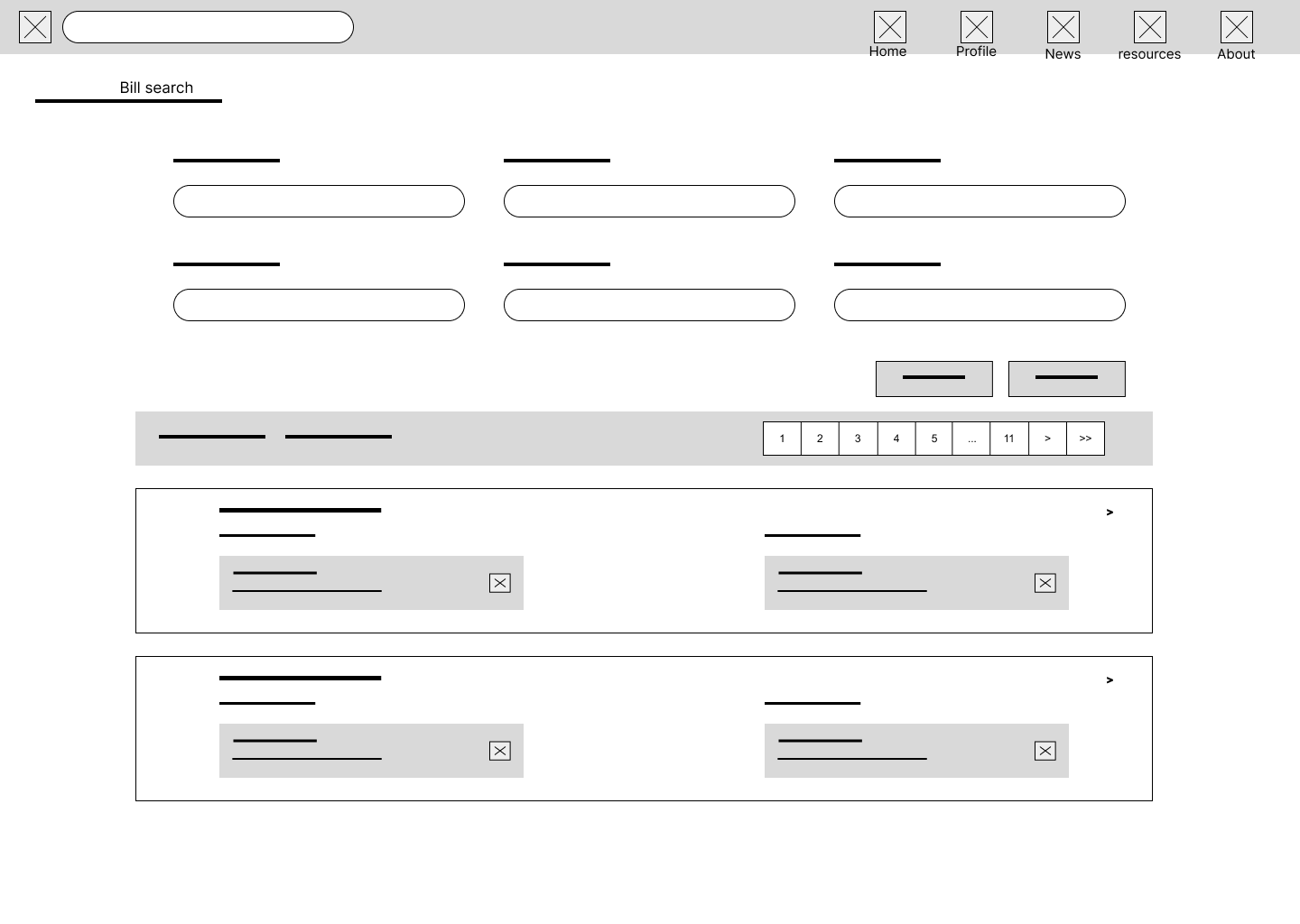
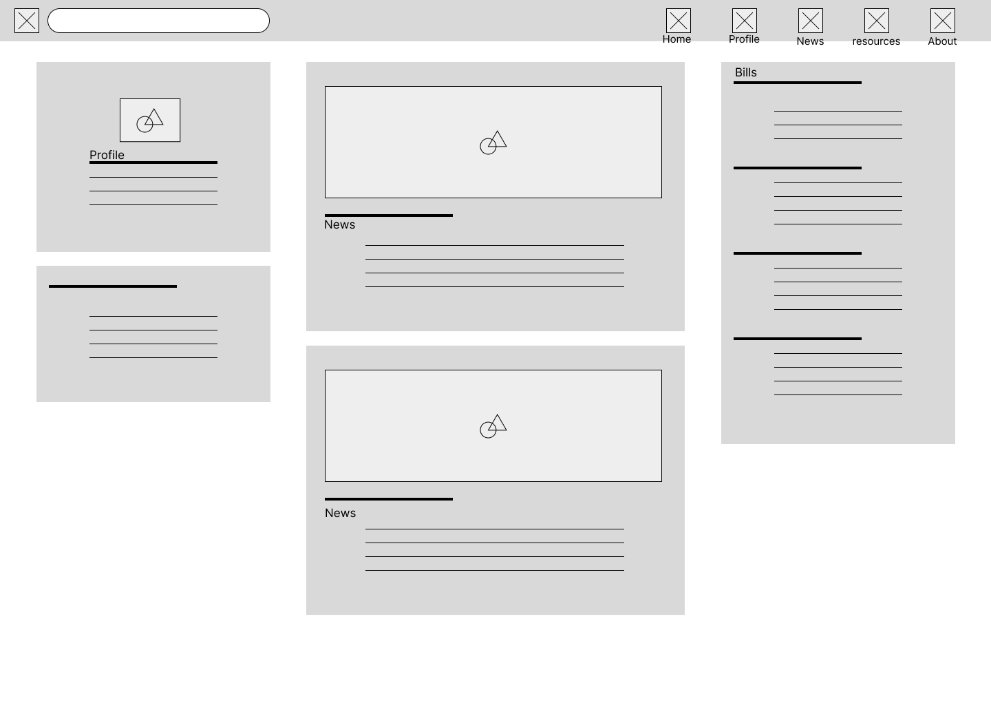
I utilized the Crazy 8 process to design 8 wireframes for a desktop view website that needed to be visually similar to the mobile size while remaining functional. The focus was on implementing the site map and designing pages with a clear and efficient user experience. I kept in mind the importance of layout, accessibility, and navigation while designing the wireframes. The main challenge was to maintain consistency between the desktop and mobile versions of the website while still providing a seamless and intuitive user experience.

wirefrmae wirefrmae wirefrmae wirefrmae wirefrmae wirefrmae wirefrmae

Digital Wireframes

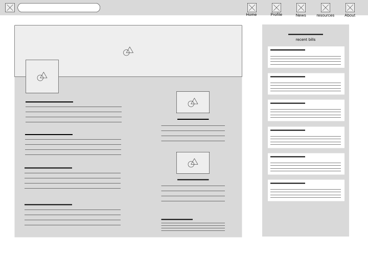
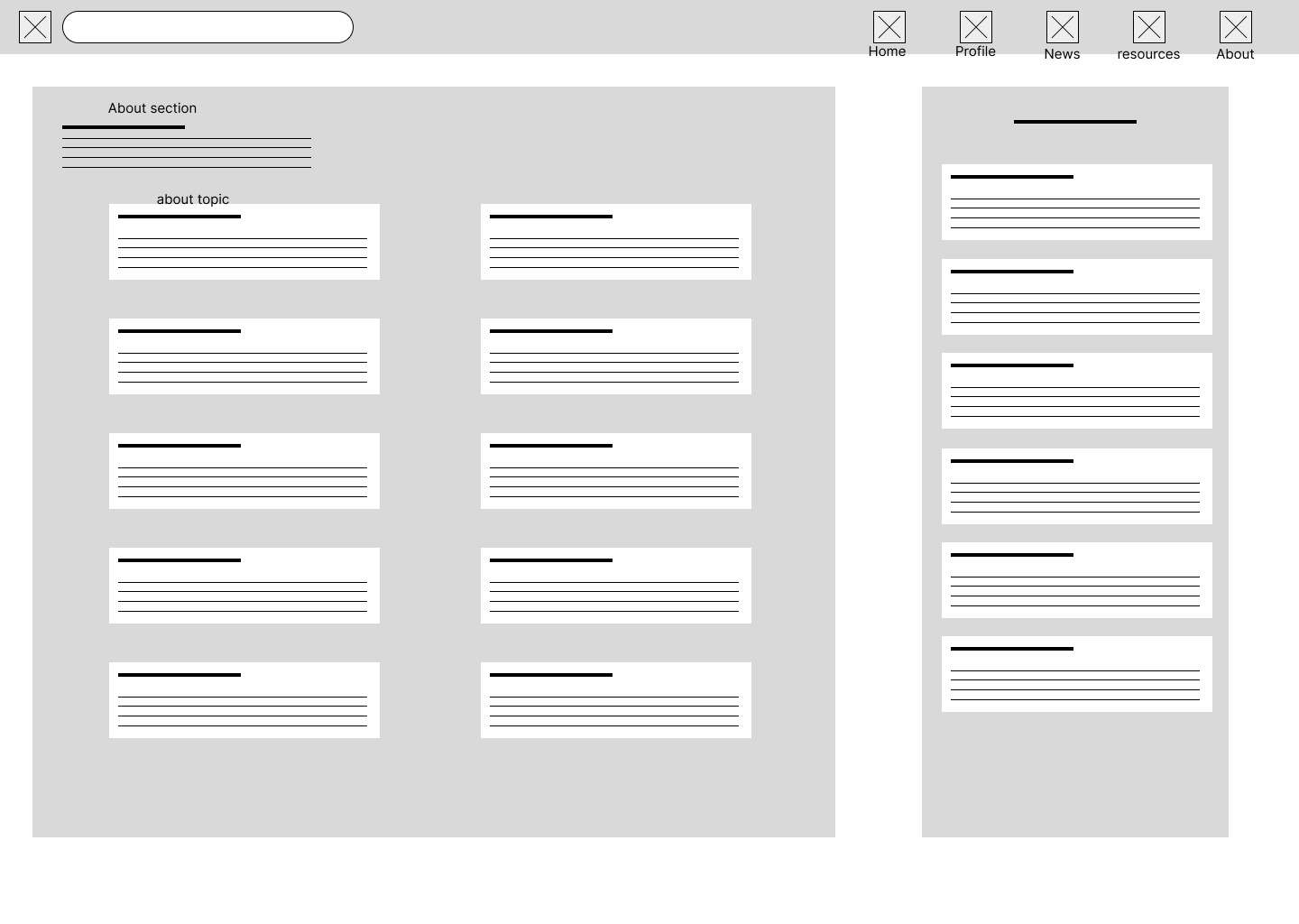
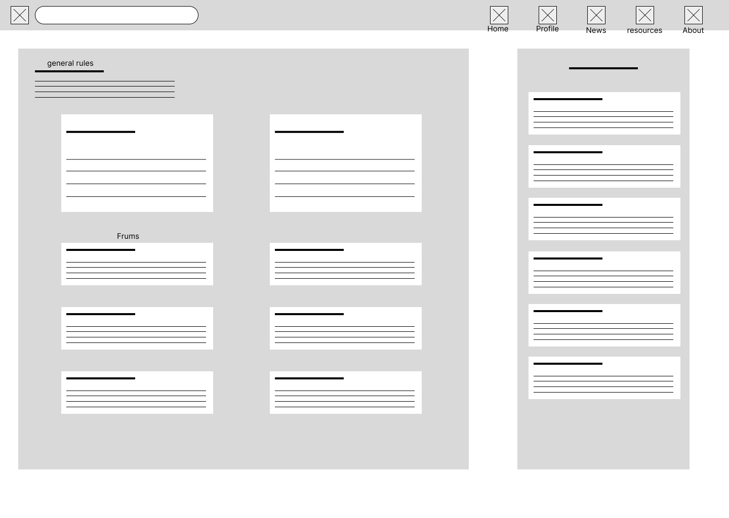
I focused on creating a clear and user-friendly layout for my wireframe, with easy navigation and accessibility. I received feedback from my peers and made changes to improve the overall design, including simplifying the navigation and improving the visual consistency. I implemented peer feedback by reviewing and considering suggestions on the layout and organization of the site, ensuring that it is visually similar and functional on both desktop and mobile devices. I incorporated responsive design elements to ensure that the site could be easily accessed and navigated on various screen sizes. Overall, my thought process was to prioritize usability and accessibility for the users while maintaining a consistent design aesthetic.

wirefrmae Digital wirefrmae Digital wirefrmae Digital wirefrmae Digital wirefrmae Digital wirefrmae Digital wirefrmae Digital wirefrmae

bug_report Usability Study

Parameters

Study type:

Unmoderated usability study

Location:

United Kingdom, London, remote

Participants:

5 participants

Length:

20-30 minutes

Usability study for the mobile app: findings

The following are findings from a usability study conducted on the mobile app.

Previus read Bills

Users found it helpful to have a history of bills they were following on their profile page, but had difficulty locating it within the navigation bar.

Access to the news

Easy access to news related to proposed bills was highly important to users, as it was the main goal of the app: to stay informed about proposed bills affecting immigrant families.

Feedback

The about section, which allowed users to provide feedback, was well received and appreciated.

Usability study for responsive website: findings

The following are findings from a usability study conducted on the responsive website version.

Bills section

Users liked the fact that the bills section was easily accessible from the navigation bar, as it was one of the most important features of the website.

Resouces

Some users suggested that the "resources" section could be better organized, with clearer categories and subcategories to help them find what they were looking for more easily.

Feedback

The community section was found to be a valuable resource for users. Were user can access quickly to previous topic.

architecture Mockups

Mockups website desktop version
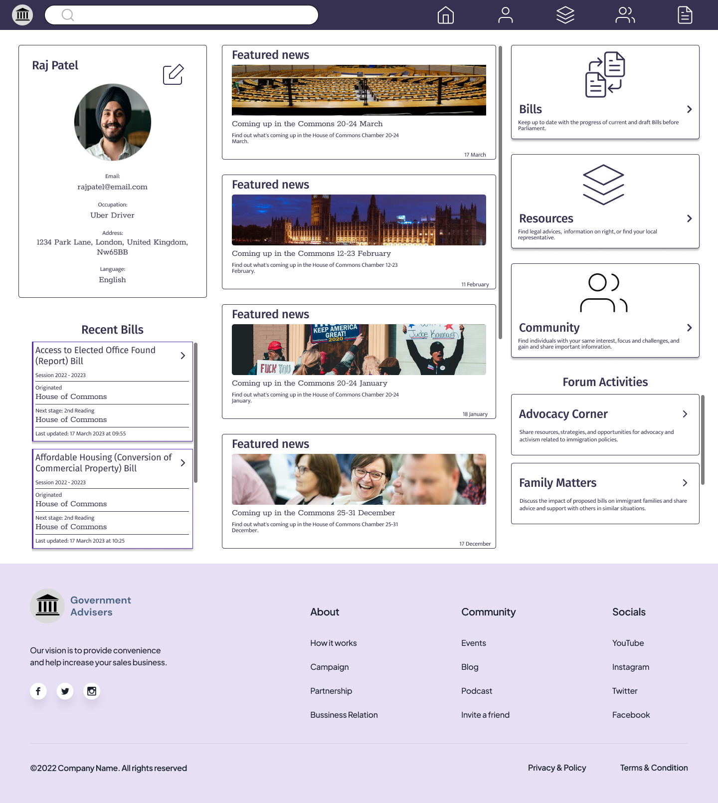
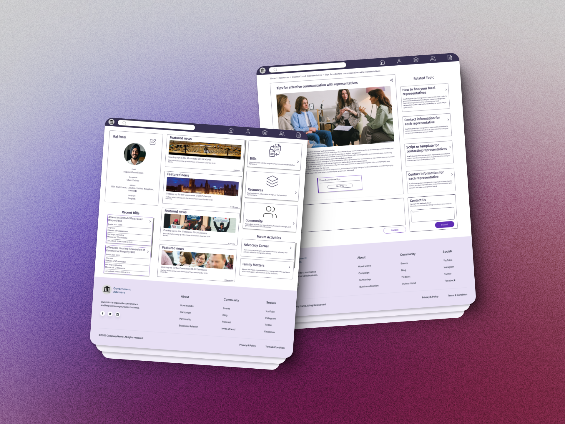
Focused on making the mockups consistent with the wireframes I wanted to ensure that the layout was clean and intuitive, so I kept the design simple and straightforward. For accessibility, I paid particular attention to contrast ratios to ensure that text and other elements were easy to read and distinguish from one another. I also made sure to adhere to accessibility guidelines when choosing font sizes and styles to ensure that all users could easily read and interact with the interface.

Digital wirefrmae
Digital wirefrmae

Mockups website mobile version

Additionally, I created a similar layout for the mobile version, ensuring that it maintained continuity, consistency, and accessibility with the desktop version. I paid particular attention to the contrast between text and background to ensure that it was easily readable on smaller screens, and the navigation was adjusted to be thumb-friendly for improved accessibility.

Digital wirefrmae Digital wirefrmae Digital wirefrmae Digital wirefrmae

all_inclusive All Inclusive

Accessibility considerations

Colour contrast

Ensuring that text and graphics have enough contrast with the background for people with colour vision impairments.

Use of headers

Using header tags to structure content in a logical order, which makes it easier to navigate with screen readers.

Alt text

Providing alternative text for non text elements such as images, icons, and graphs, for users who rely on screen readers.

Limited knowledge of political systems

For some users, their lack of knowledge about the political systems in the United States may be a barrier to effective engagement and advocacy. They may not know how to navigate the system or understand the impact of proposed bills on their families and communities.

cognition Takeaway

task_alt Impact:

By providing clear and concise information, and creating an easy-to-use interface, I believe that the platform can empower and inform users, helping them to stay engaged and active in the political process. I did receive positive feedback from my peers and study participants, who praised the platform's accessibility and ease of use.

auto_stories What I learned:

Through this project, I learned the importance of user research, feedback, and accessibility in designing a user-friendly and effective experience. I also gained valuable skills in wireframing, prototyping, and designing for different devices.

Thank You

Thank you for your interest in this project. If you have any questions or would like to see more of my work, please feel free to contact me.


contract Mobile app for a fitness studio

contract Project Overview

Mobile app for a fitness studio that allows users to schedule and book classes, track their fitness progress, and connect with other members.

brightness_alert The Problem

Many fitness enthusiasts struggle to find a convenient and effective way to schedule and book classes, track their fitness progress, and connect with other like-minded individuals. Traditional methods of scheduling and booking classes can be time-consuming and many fitness apps lack the social and community features that are important for staying motivated and engaged.

award_star The Goal

Our goal is to create a mobile app that provides a seamless and convenient platform for users to schedule and book classes, track their fitness progress, and connect with other members.

assignment_ind My role

  • Led the user experience design process from concept to final implementation.
  • Acted as the primary point of contact between the design team and other stakeholders.
  • Advocated for user-centric design principles throughout the project lifecycle.
  • Facilitated workshops and brainstorming sessions to gather insights and foster collaboration.
  • Communicated design decisions and rationale to the development team and stakeholders.

task_alt Responsabilities

  • Conducted comprehensive user research to understand user needs, preferences, and pain points.
  • Created detailed user personas and problem statements to guide the design process.
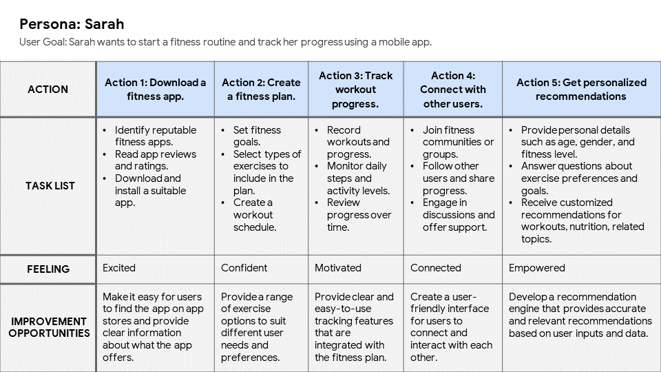
  • Developed user journey maps to visualize the user experience and identify opportunities for improvement.
  • Designed intuitive and user-friendly interfaces through wireframes and prototypes.
  • Tested and iterated on the design based on user feedback and usability studies.
  • Ensured the app's design was inclusive and accessible to all users.

person_search User Research:

Summary

The goal of the user research was to understand what people who are interested in fitness want in a mobile app. The research involved talking to people, asking them questions, and having them try out different versions of the app. The findings of the research helped us understand what features are important to users, what frustrates them about existing fitness apps, and what motivates them to stick with their fitness routine. This information will be used to create a mobile app that is easy to use, helpful, and meets the needs of our target audience.

Pain points

Difficulty in finding and booking classes

Users expressed frustration with the process of finding and booking classes, including the lack of a user-friendly interface, confusing navigation, and limited availability of preferred class times.

Lack of motivation and accountability

Users reported that they often struggle with staying motivated and accountable to their fitness goals. They expressed a desire for features that help them track their progress, set goals, and connect with other like-minded individuals for support and encouragement.

Limited customization options

Users expressed a desire for more customization options, such as the ability to personalize their workout plans and set their own fitness goals. They felt that the app should cater to their unique needs and preferences, rather than offering a one-size-fits-all solution.

assignment_ind User Persona

Sarah Lopez, a busy working mom, needs a convenient and flexible fitness solution because she struggles to find the time and motivation for regular workouts amidst her busy schedule. Sarah wants to be fit and healthier and here I describe the needs to be connected and empowered to choose what is better for her and for her schedule.

slide
emphaty map
Journey-Map

web Site Map

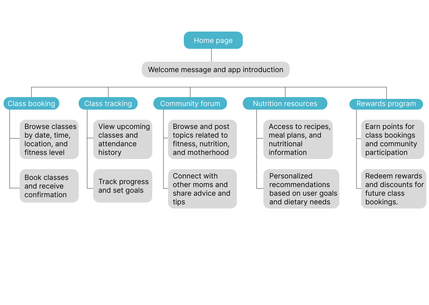
The site map reflects this by organizing the app features and functions in a way that makes it easy for Sarah to find and book classes, track her fitness progress, and connect with other moms in the same situation. The home screen includes quick links to popular classes and options to search for classes by time and location. The app also includes social features that allow Sarah to connect with other users, share her progress, and receive motivation and support from her peers.

Site map

draw Scketches and Wireframes

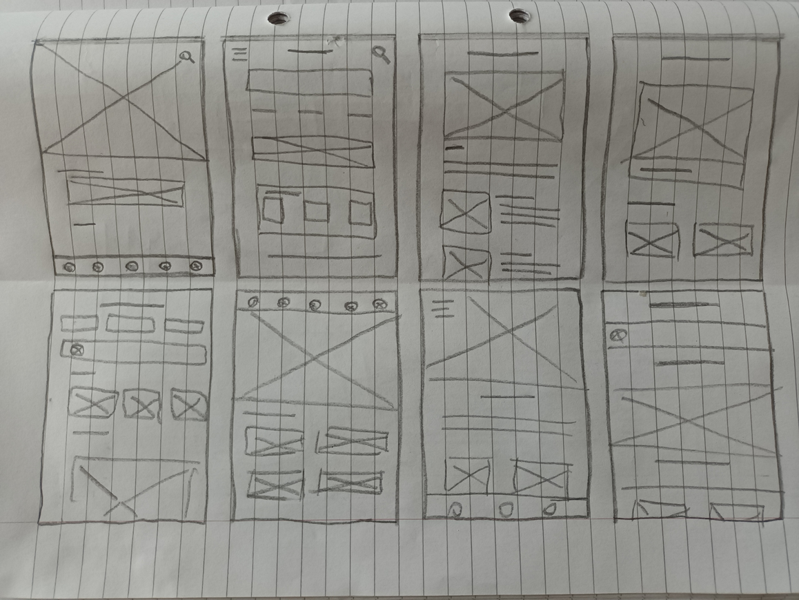
Paper Wireframes

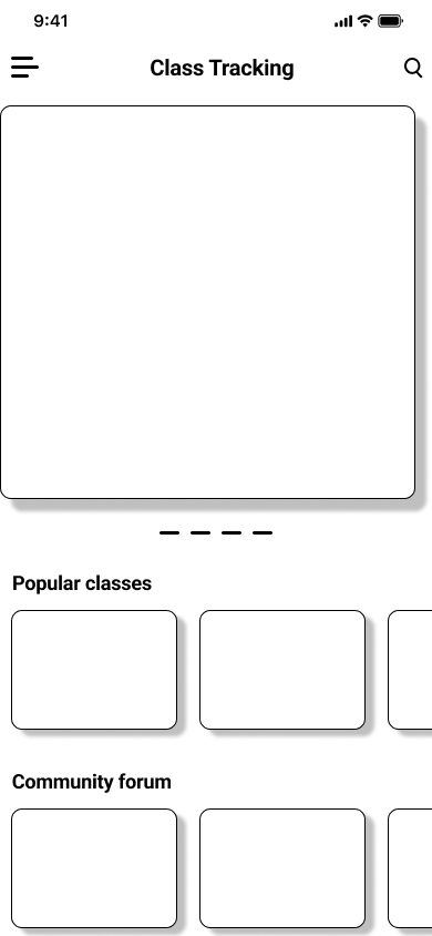
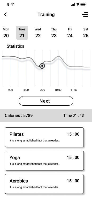
The mobile app will have a home screen with options to book a class, view upcoming classes, track progress, and connect with other users. The "Book a Class" screen will allow users to select the class, date, and time they want to attend. The "Upcoming Classes" screen will display the user's schedule and allow them to cancel or reschedule classes. The "Track Progress" screen will have options to input and view workout information, including duration, type of exercise, and calories burned. The "Connect" screen will allow users to connect with other users, join groups, and share results.

wirefrmae

Digital Wireframes

Our goal was to create a clean and easy-to-use mobile app for fitness studio members like Sarah. We created a wireframe based on the sitemap to ensure a linear navigation experience for the user. This will allow Sarah to easily navigate between the app's pages and find the features she needs to achieve her fitness goals.

wirefrmae Digital wirefrmae Digital wirefrmae

bug_report Usability Study

Parameters

Study type:

Unmoderated usability study

Location:

United Kingdom, London, remote

Participants:

5 participants

Length:

25-30 minutes

Usability study: findings

The participants found the low fidelity prototype to be user-friendly and easy to navigate. They provided some useful feedback on design and functionality, which will be taken into consideration for the development of the high fidelity prototype.

Navigation

Participants expressed a preference for a cleaner, more modern design. They suggested using more white space and simplifying some of the graphics and icons.

Design

Easy access to news related to proposed bills was highly important to users, as it was the main goal of the app: to stay informed about proposed bills affecting immigrant families.

Functionality

Participants reported a few minor issues with functionality, such as difficulty scrolling on certain pages and some links not working properly. These issues were easily fixed and did not significantly impact the overall usability of the prototype.

architecture Mockups

Mockups: Original screen size

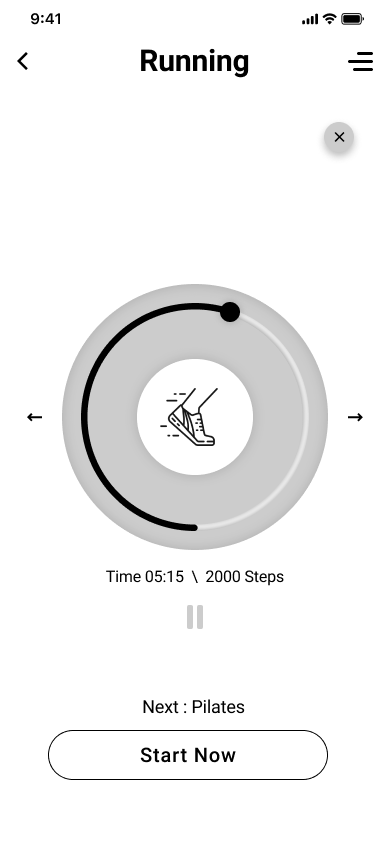
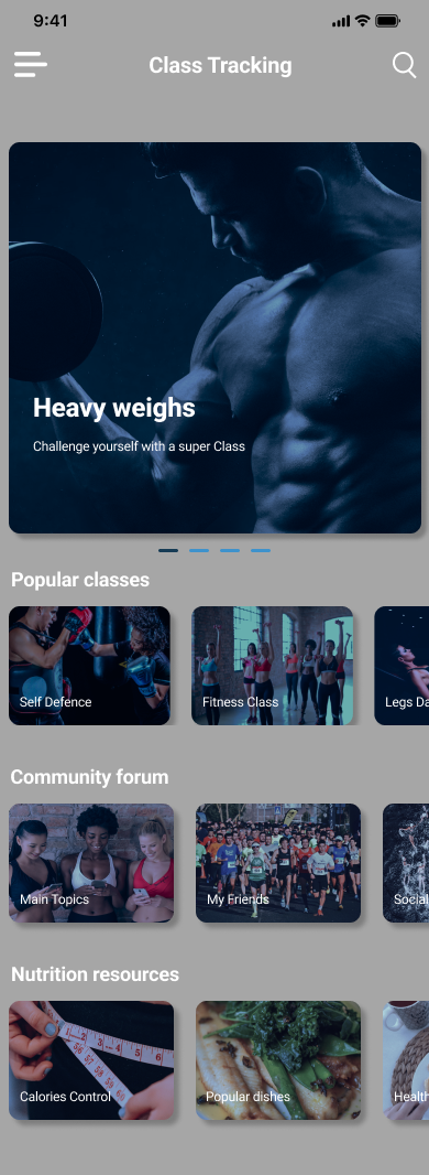
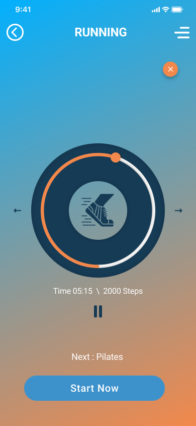
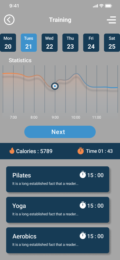
The high-fidelity prototype is a fully functional version of the fitness app we are developing. It includes the main features such as tracking workouts, setting goals, and viewing progress. Users can create their profiles, browse exercises, and schedule workouts. The app also provides personalized recommendations based on the user's fitness level and goals. Overall, the high-fidelity prototype showcases the app's key functions and how users can interact with them. View the High-Fidelity Prototype

Digital wirefrmae Digital wirefrmae Digital wirefrmae Digital wirefrmae Digital wirefrmae Digital wirefrmae

all_inclusive All Inclusive

Accessibility considerations

Alternative text for images:

Screen readers rely on alternative text to describe images to users who are visually impaired so it was essential to provide descriptive and accurate alt text for all images in the app.

Use of an appropriate colour contrast:

Ensured that the colour contrast between text and the background is sufficient to make it easily readable for users with visual impairments.

Use of a legible font size and style:

Avoided small font sizes that may be difficult for some users to read and used a good hierarchy.

cognition Takeaway

task_alt Impact:

The fitness app we designed has the potential to positively impact people's health and wellness by providing them with personalized workout plans and tracking their progress.

auto_stories What I learned:

Through this project, we learned the importance of understanding user needs and considering accessibility when designing digital products. We also learned the value of conducting user testing and incorporating feedback into the design process.

Thank You

Thank you for your interest in this project. If you have any questions or would like to see more of my work, please feel free to contact me.


contract Design a donation flow for charity

contract Project Overview

The Big Heart Foundation is a non-profit charitable organization based in the UK, operating globally to support vulnerable communities including homeless individuals, disabled persons, single mothers, and children in need. Their goal is to raise awareness of emergencies and the impact of donations on their work. Donations are used to make a positive impact on the lives of those they serve, promoting humanitarian aid, education and healthcare, and facilitating community development.

brightness_alert The Problem

Challenge in creating a webpage that effectively communicated its mission and activities while encouraging users to donate.

award_star The Goal

The primary goal was to design a webpage that was intuitive and simple to use and navigate, providing all important information on the main page. The webpage was designed to be mobile-friendly, ensuring that it was accessible to users on all devices.

assignment_ind My role

  • Guided the user experience design process, ensuring each phase from conceptualization to final implementation adhered to best practices and project goals.
  • Acted as the main liaison between the design team and other stakeholders, including project managers, developers, and marketing teams, ensuring clear and consistent communication.
  • Promoted and enforced user-centered design principles throughout the project, ensuring that user needs and preferences were at the forefront of all design decisions.
  • Organized and led workshops, brainstorming sessions, and design sprints to gather insights from various stakeholders and foster a collaborative environment. These sessions were key in shaping the project’s direction and ensuring buy-in from all parties involved.
  • Presented design concepts, wireframes, prototypes, and final designs to stakeholders, clearly explaining the rationale behind design choices and how they aligned with user needs and project goals. This included creating presentations and detailed documentation to support design decisions.

task_alt Responsabilities

  • Conducted in-depth user research to gain a thorough understanding of user needs, preferences, and pain points. This involved conducting interviews, surveys, and creating empathy maps to capture insights from potential donors and website users.
  • Developed detailed user personas and problem statements based on research findings. These personas represented key user groups and guided the design process by keeping the team focused on addressing real user needs and challenges.
  • Created comprehensive user journey maps to visualize the entire user experience, from initial website visit to final donation. These maps highlighted key touchpoints, pain points, and opportunities for improving the user experience.
  • Designed intuitive and user-friendly interfaces through a combination of wireframes and prototypes. This iterative process involved sketching initial concepts, creating digital wireframes, and developing both low and high-fidelity prototypes to refine the design.
  • Conducted usability studies to test the design with real users. Collected feedback on usability, navigation, and overall user satisfaction. Based on this feedback, iterated on the design to enhance usability and meet user expectations.
  • Ensured that the website’s design was inclusive and accessible to all users, regardless of their abilities. This included following accessibility best practices, such as using appropriate color contrast, designing for keyboard navigation, and ensuring compatibility with screen readers.

person_search User Research:

Summary

Here's the extracted text from the provided PDF document: Design a donation flow for charity Giovanni Delle Donne The product: The Big Heart Foundation is a non-profit charitable organization based in the UK, operating globally to support vulnerable communities including homeless individuals, disabled persons, single mothers, and children in need. Their goal is to raise awareness of emergencies and the impact of donations on their work. Donations are used to make a positive impact on the lives of those they serve, promoting humanitarian aid, education and healthcare, and facilitating community development. Project overview Project duration: February 2023 to March 2023 The problem: Challenge in creating a webpage that effectively communicated its mission and activities while encouraging users to donate. Project overview The goal: The primary goal was to design a webpage that was intuitive and simple to use and navigate, providing all important information on the main page. The webpage was designed to be mobile-friendly, ensuring that it was accessible to users on all devices. My role: UX Designer leading the Big Heart Foundation’s website design. Project overview Responsibilities: Conducting interviews, paper and digital wireframing, low and high-fidelity prototyping, conducting usability study, iterating on the designs and responsive design. Understanding the user User research Personas Problem statements User journey maps User research: summary I conducted interviews and created empathy maps to understand the users I'm designing for and their needs. I found that the main challenges that users face are understanding who the organization is, how donations are used, which emergencies are involved, and the impact of their contributions.

Pain points

Navigation:

The navigation had to be intuitive and smooth. Users needed to find information and complete the donation process effortlessly.

Interactions:

The donation button had to be clear and visible. It was crucial for users to easily locate and use the donation button without confusion.

Information:

All key information needed to be accessible and simple to navigate to and from. Users required clear, concise information about the organization, its mission, and the impact of donations.

assignment_ind User Persona

John is a 65-year-old retired accountant who resides in a suburban neighborhood with his wife. He has two grown children and several grandchildren whom he adores. John is dedicated to helping others and has a longstanding commitment to charitable donations. Recently, he has become more concerned about the impact of his contributions and wants to ensure his money is used effectively. John faces mobility challenges due to arthritis, which limits his ability to attend in-person events.

slide
slide

Sarah is a 35-year-old single mother who balances her full-time job as a nurse with raising her two young children in California. She is deeply committed to giving back to her community despite having limited disposable income. Sarah is cautious about the legitimacy of charities and wants to make sure that her donations are being used appropriately and effectively.

Tom is a 40-year-old individual with a disability who works part-time in a customer service role. He lives in New York and is an orphan. Tom is passionate about supporting charities that assist people with disabilities, but he finds it challenging to obtain information about these organizations. His part-time job limits his financial capacity, and his disability makes it difficult for him to attend in-person events.

slide
slide

Maria is a 30-year-old lawyer who lives in New York. As a busy professional, she works long hours and has a strong desire to make a positive impact on the world. However, Maria struggles to find the time to research and evaluate charities. She is also concerned about the transparency and effectiveness of charitable organizations, wanting to ensure that her contributions make a significant difference.

web Site Map

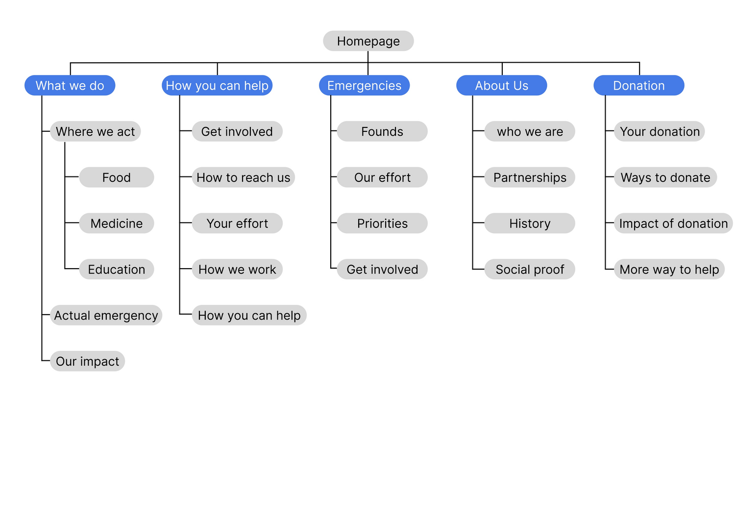
The website navigation was the primary pain point for the user. So I used that knowledge to create a sitemap. My goal here was to create an information architecture that would improve the overall navigation. The structure that I chose was designed to make things easy and simple.

Site map

draw Scketches and Wireframes

Paper Wireframes

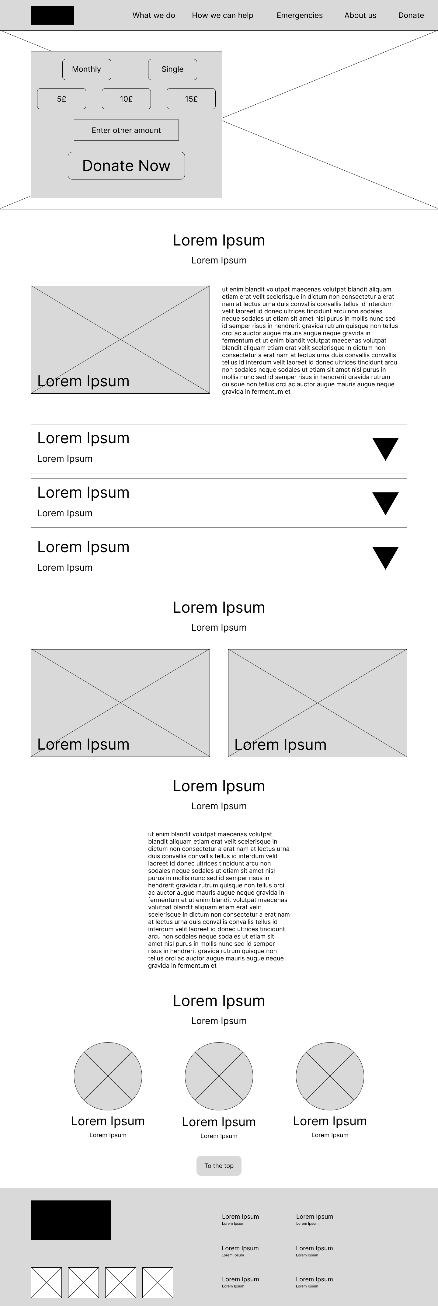
TNext, I sketched out paper wireframes for each screen of the website, keeping user pain points about navigation, information, and user flow. The home screen paper wireframe variations to the right focus on delivering all the key information to improve user experience.

wirefrmae wirefrmae wirefrmae wirefrmae wirefrmae wirefrmae wirefrmae wirefrmae

Digital Wireframes

Moving from paper to digital wireframes made it easy to understand how the design could address user pain points. Prioritizing useful buttons and adding visual elements was the key point of my design.

wirefrmae wirefrmae wirefrmae wirefrmae wirefrmae wirefrmae

bug_report Usability Study

Parameters

Study type:

Unmoderated usability study

Location:

United Kingdom, London, remote

Participants:

5 participants

Length:

25-30 minutes

Usability study: findings

The usability study highlighted the importance of clear information presentation, prominent donation buttons, and an intuitive user flow. These insights were instrumental in refining the website design to better meet user needs and encourage donations.

Clear Information Listing:

Users encountered difficulty understanding certain sections that heavily relied on icons without any accompanying text. To address this issue, I made a change. Instead of using icons alone, I included descriptive text alongside them. This modification ensured that users could easily comprehend the content without any confusion.

Donation Button Visibility:

The donation button was not as prominent as it needed to be, which made it difficult for users to locate and use effectively. To address this issue, I redesigned the donation button to stand out more. It is now very visible and easily accessible on all pages. This improvement aims to facilitate the donation process and encourage more contributions.

Overall Goal Clarity:

Users appreciated a clear and concise presentation of the overall goal of each page. To achieve this, I ensured that the primary objective of each page was articulated clearly and succinctly. This approach helps users quickly understand the purpose of the page and navigate accordingly.

Proper Information Listing:

Users appreciated having all relevant information listed properly and descriptively. To achieve this, I meticulously detailed key information, ensuring that users could find what they needed without any hassle.

Intuitive and Simple Flow:

Ensuring a smooth and intuitive flow was crucial for creating a positive user experience. To achieve this, I meticulously designed the website flow to be as straightforward and intuitive as possible. Users can now navigate seamlessly from one section to another, enhancing their overall experience.

architecture Mockups

Mockups: Original screen size

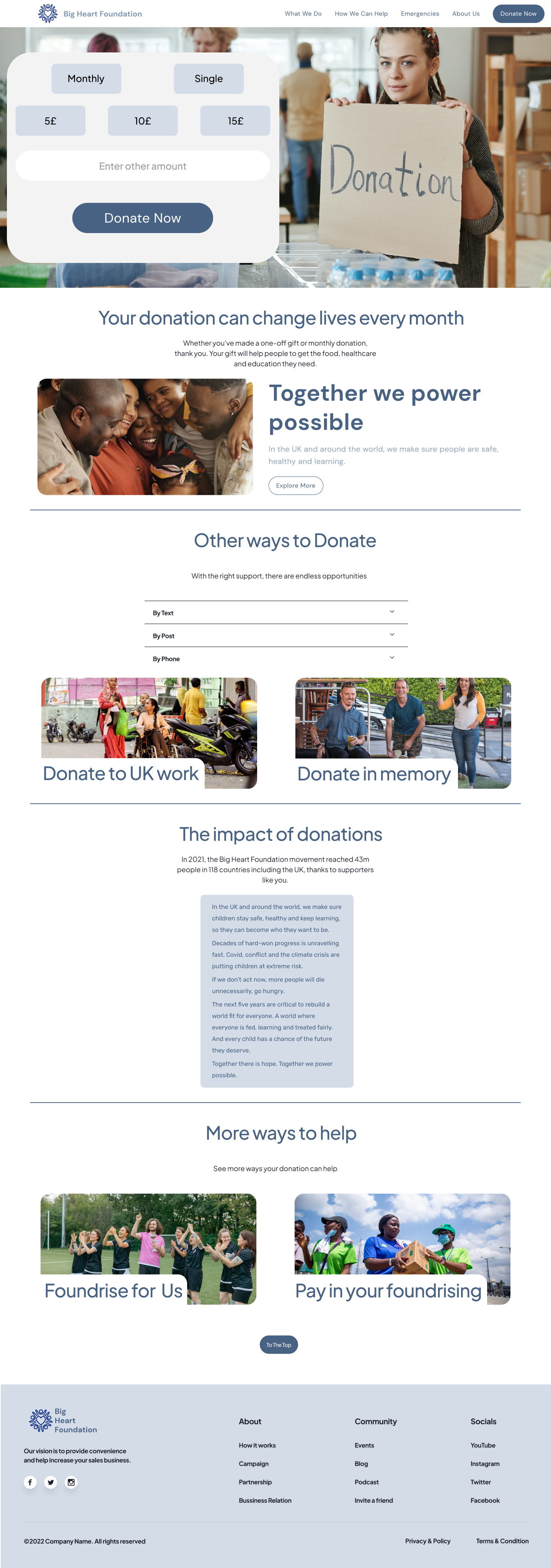
Based on the insight from the usability study, I made changes to improve the site flow. One of the changes that I made was to add the donate button on the navigation bar, making it always available, in order to improve the overall goal of the website.

Digital wirefrmae Digital wirefrmae Digital wirefrmae Digital wirefrmae Digital wirefrmae Digital wirefrmae Digital wirefrmae Digital wirefrmae Digital wirefrmae Digital wirefrmae Digital wirefrmae Digital wirefrmae

all_inclusive All Inclusive

Accessibility considerations

Visual Hierarchy

To ensure that content is easily navigable and understandable, different heading sizes were employed to create a distinct visual hierarchy. This approach helps users with visual impairments discern the structure and importance of the content, making it easier to follow and interact with.

Navigation Clarity

The navigation bar was designed with bold text against a high-contrast background color to clearly indicate the user’s current location within the site. This visual cue aids users in quickly identifying their position and facilitates easier navigation, especially for those with visual challenges.

Contrast Ratio

The contrast ratio of 11.78:1 not only meets but exceeds the standards set by WEBAIM for accessibility. This high contrast ratio ensures that text stands out against its background, significantly improving readability for users with low vision and those who struggle with perceiving color differences.

cognition Takeaway

task_alt Impact:

The participants shared that the design was intuitive to navigate through, engaging with images and demonstrating a clear visual hierarchy.

auto_stories What I learned:

I learned that even a small change in design can have a huge impact on the user experience. The most important takeaway for me is to always focus on the real needs of the users.

Thank You

Thank you for your interest in this project. If you have any questions or would like to see more of my work, please feel free to contact me.


contract Landing Page for Dental and Eye Clinic

contract Project Overview

The task was to create a landing page for Sight n Smile Clinic, a multispecialty clinic in Newtown, Kolkata, that provides both eye and dental care. The clinic is known for its advanced technology and experienced specialists. The objective was to develop a website that reflects their expertise and advanced services, making it easy for patients to access information and book appointments.The goal was to design a new, engaging, and user-friendly landing page using WordPress. The design needed to effectively showcase the clinic’s services while aligning with their existing brand colors, making the information easily accessible to users.

brightness_alert The Problem

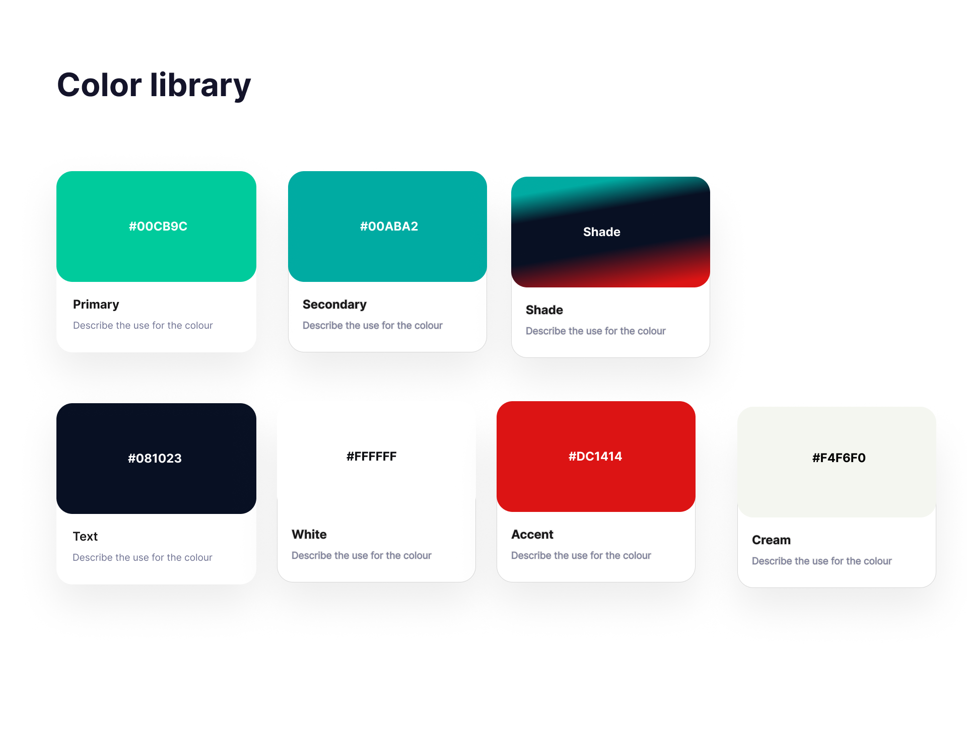
The primary challenge was to create a color palette that resonated with the clinic’s logo, which featured dark blue, green, and red. This made it difficult to achieve a modern and sophisticated look. Additionally, the design needed to highlight all the services provided by the clinic and ensure that users could easily navigate and find the information they needed.

award_star The Goal

The goal was to design a landing page that was simple, linear, and easy to implement on WordPress. The page needed to engage users and showcase all the clinic’s services, facilitating easy booking and providing clear, accessible information.

assignment_ind My role

  • Conducted thorough user research to understand industry trends and ensure competitive edge.
  • Maintained regular client communication, adjusting design based on feedback for optimal results.
  • Implemented iterative design process based on user and client feedback.
  • Prioritized accessibility with clear visual hierarchies and screen reader compatibility.

task_alt Responsabilities

  • Creating paper and digital wireframes
  • Developing low and high-fidelity prototypes
  • Conducting usability studies
  • Ensuring accessibility
  • Iterating and refining the design
  • Making the design responsive across devices

person_search User Research:

Summary

I conducted user research to understand the needs and pain points of the clinic’s patients. This included interviews and creating empathy maps to identify user concerns and preferences.

Pain points

Specialization Concerns:

Many clients were anxious about choosing a clinic that handled both eye and dental care, preferring specialized services. The design needed to highlight the clinic’s expertise and advanced technology to reassure users.

Navigation Difficulties:

Users needed quick access to information. The design needed a clear navigation system to ensure users could find what they needed immediately.

Engagement and Interaction:

Users wanted easy ways to book appointments and contact the clinic. The design needed to include a straightforward booking system and clear contact information.

draw Scketches and Wireframes

Paper Wireframes

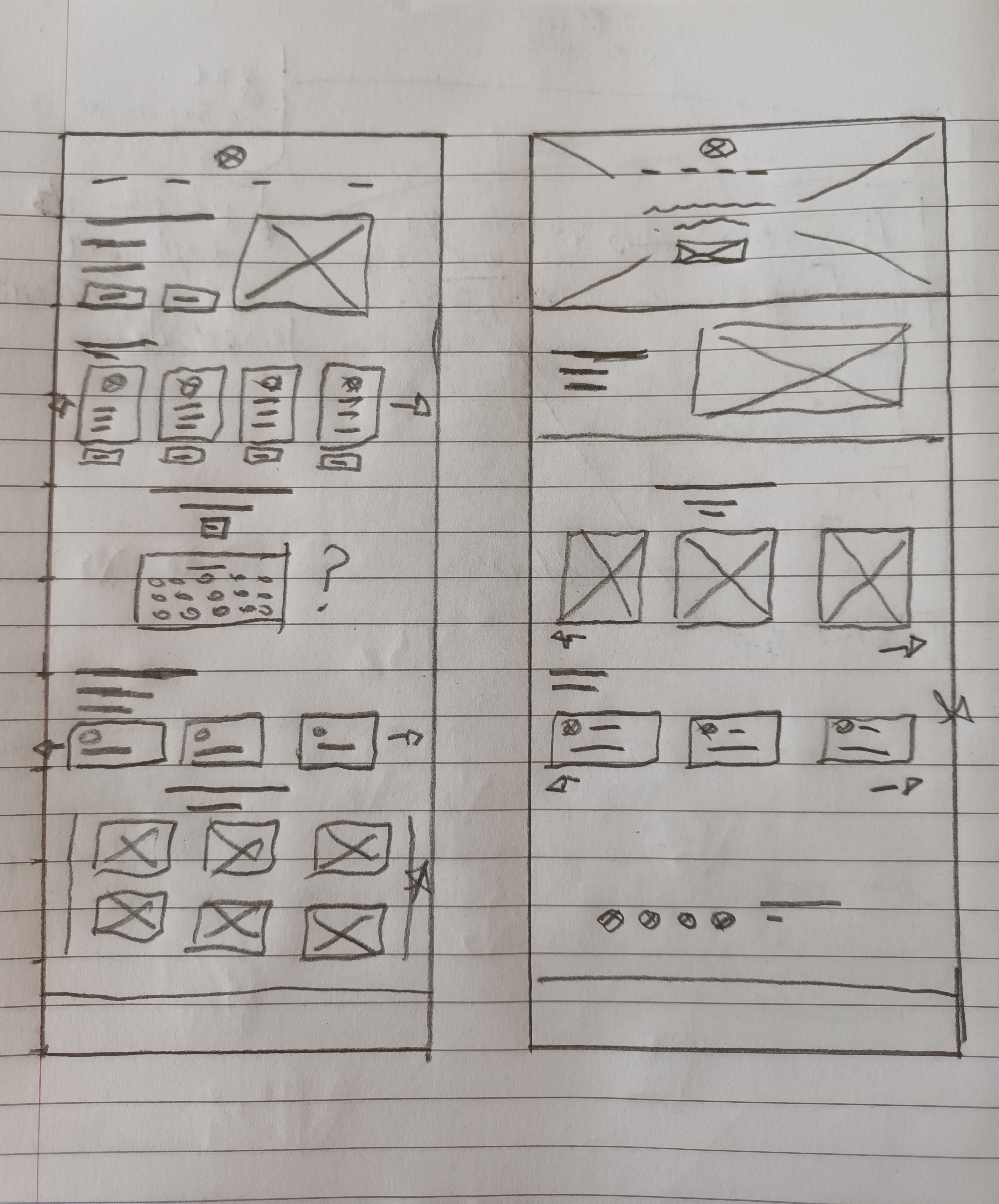
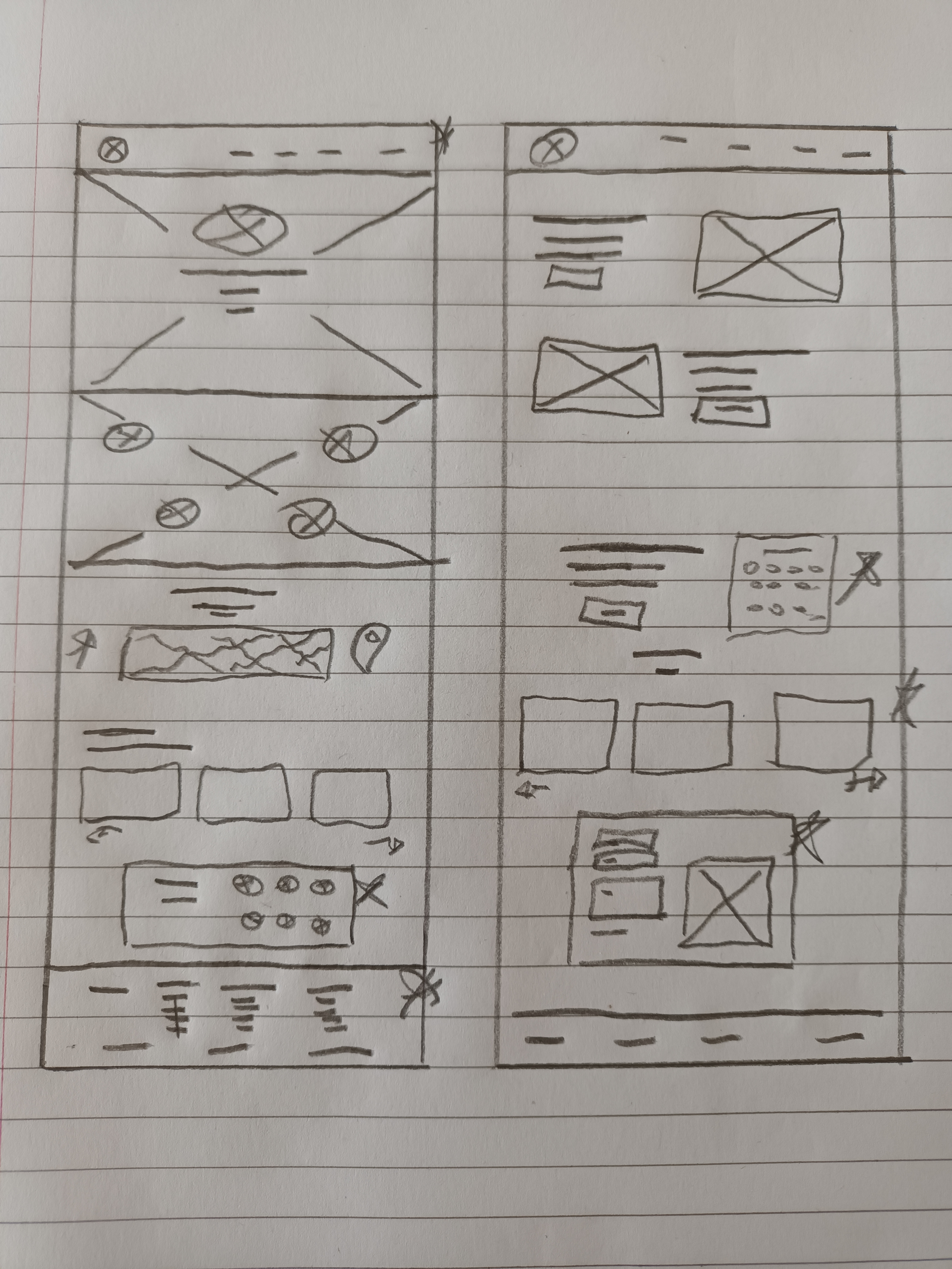
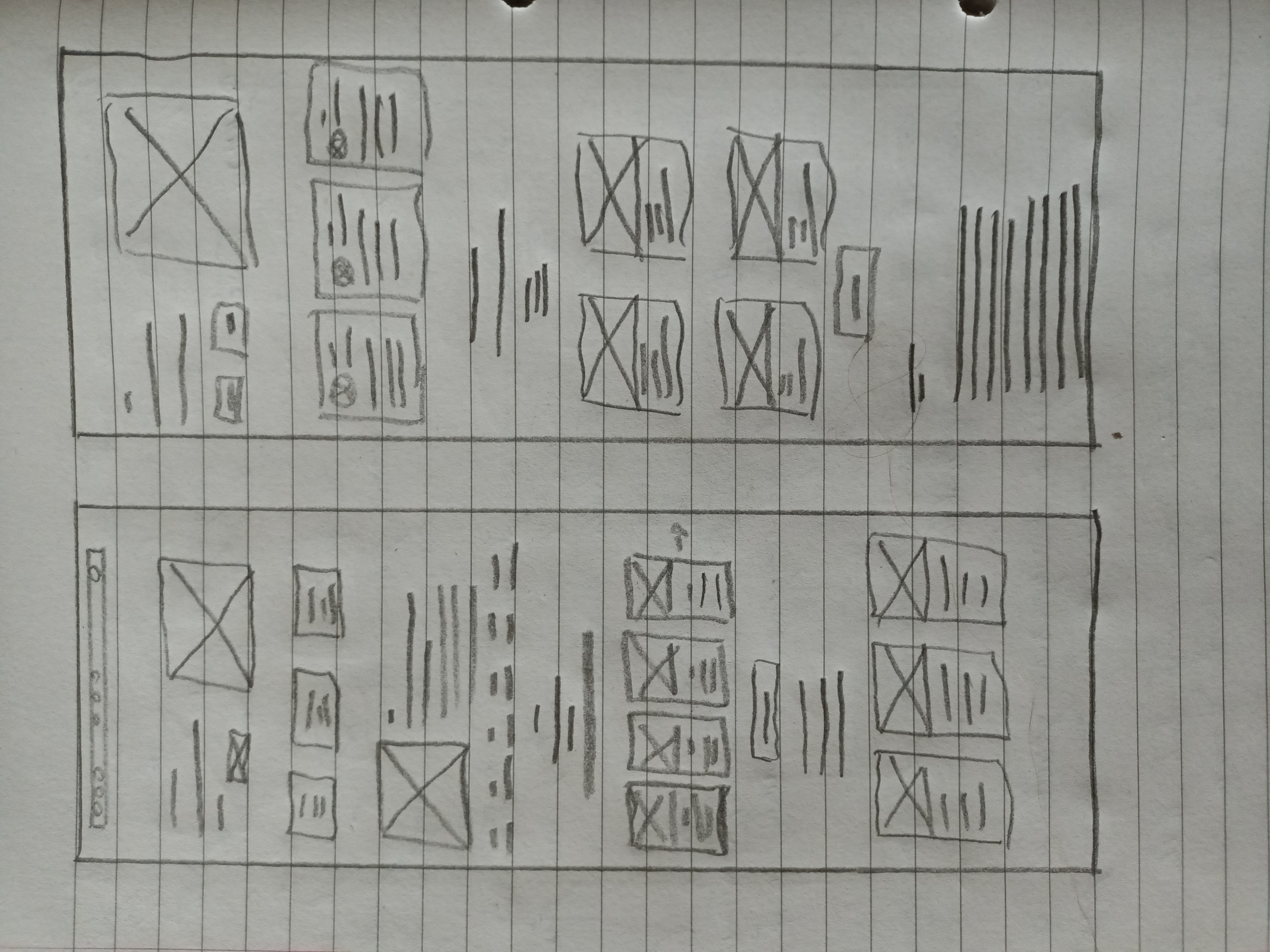
I began with sketching paper wireframes, keeping user pain points about navigation and information access in mind. The wireframes focused on a clean layout with clear sections for easy navigation.

wirefrmae wirefrmae

Layouts

After completing the initial sketches and paper wireframes, I transitioned to creating the digital wireframe. This step was crucial in translating the initial concepts into a more tangible format, allowing for detailed planning and feedback.

Layout and Structure:

The digital wireframe laid out the fundamental structure of the landing page, ensuring a clean, organized layout. Key sections included the header, hero section, service highlights, about us, testimonials, contact information, and an interactive map. Each section was clearly defined to ensure easy navigation and accessibility.

Hero Section:

At the top of the page, the hero section featured a prominent image slider with high-quality images representing the clinic’s eye and dental services. This section also included a clear call-to-action (CTA) button for booking appointments, designed to capture the user’s attention immediately.

Service Highlights:

The service highlights section was divided into two main parts: eye care services and dental care services. Each service was represented with an icon and a brief description, making it easy for users to quickly understand what the clinic offers. This section was designed to be visually appealing and informative, using a grid layout for clarity.

About Us:

The about us section provided a brief overview of the clinic’s mission, values, and history. It included images of the clinic and staff to create a personal connection with the users. This section aimed to build trust and credibility by showcasing the clinic’s expertise and advanced technology.

Testimonials:

The testimonials section featured positive feedback from satisfied patients, highlighting the clinic’s successful treatments and excellent patient care. Each testimonial included the patient’s name, the procedure they underwent, and their feedback. This section was designed to foster trust and encourage new patients to choose the clinic.

Contact Information:

The contact section included the clinic’s phone number, address, email, and a contact form for easy communication. An interactive map was also embedded to help users locate the clinic easily. This section was designed to ensure that all contact options were easily accessible.

Usability and Navigation:

The navigation menu was placed at the top of the page, with clear links to all main sections. A sticky header ensured that the menu was always visible as users scrolled down the page. This design choice was made to enhance usability and ensure that users could easily navigate through the site without getting lost.

Interactive Elements:

Interactive elements, such as the image slider in the hero section and clickable icons in the service highlights, were included to engage users and provide a dynamic browsing experience. These elements were designed to make the site more engaging and user-friendly.

Responsive Design:

The wireframe was designed with responsiveness in mind, ensuring that the layout would adapt seamlessly to different screen sizes and devices. This was essential to provide a consistent user experience across desktops, tablets, and mobile phones.

Client review

When I presented the wireframe to the client, they were overall very pleased with the initial design. They appreciated the clear layout and the user-friendly navigation that addressed the primary concerns of their patients. However, they had a few specific points they wanted to discuss:

Color Palette Adjustment:

While the client was happy with the overall aesthetic, they requested a slight adjustment to the color palette. They wanted the colors to more closely match their brand logo, which features dark blue, green, and red. This adjustment was necessary to ensure the design resonated with their established branding.

Section Division:

The client suggested further dividing the sections to enhance clarity and ensure that each service was distinctly highlighted. They believed this would help users find the information they needed more easily and make the website more intuitive to navigate.

Font Change:

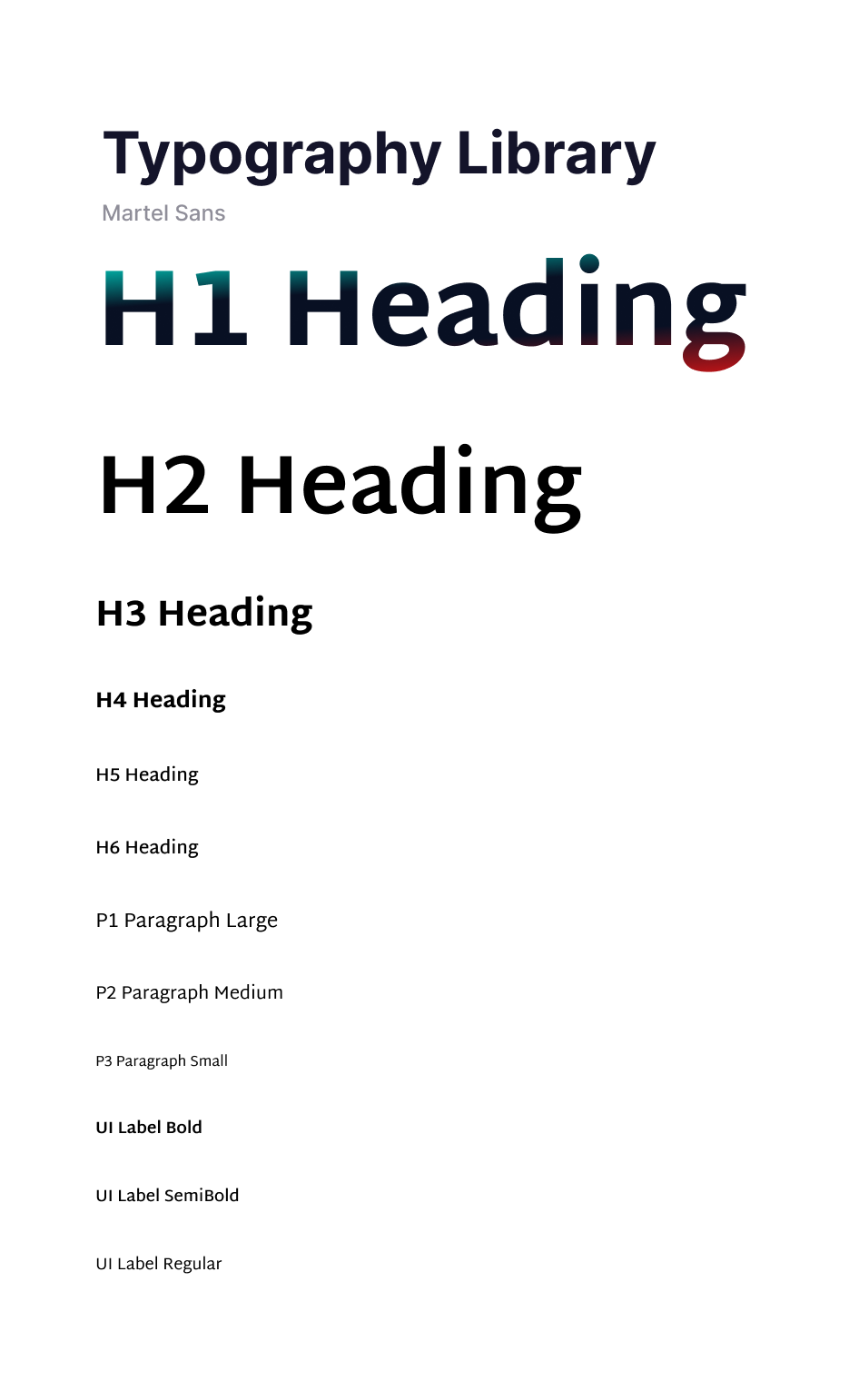
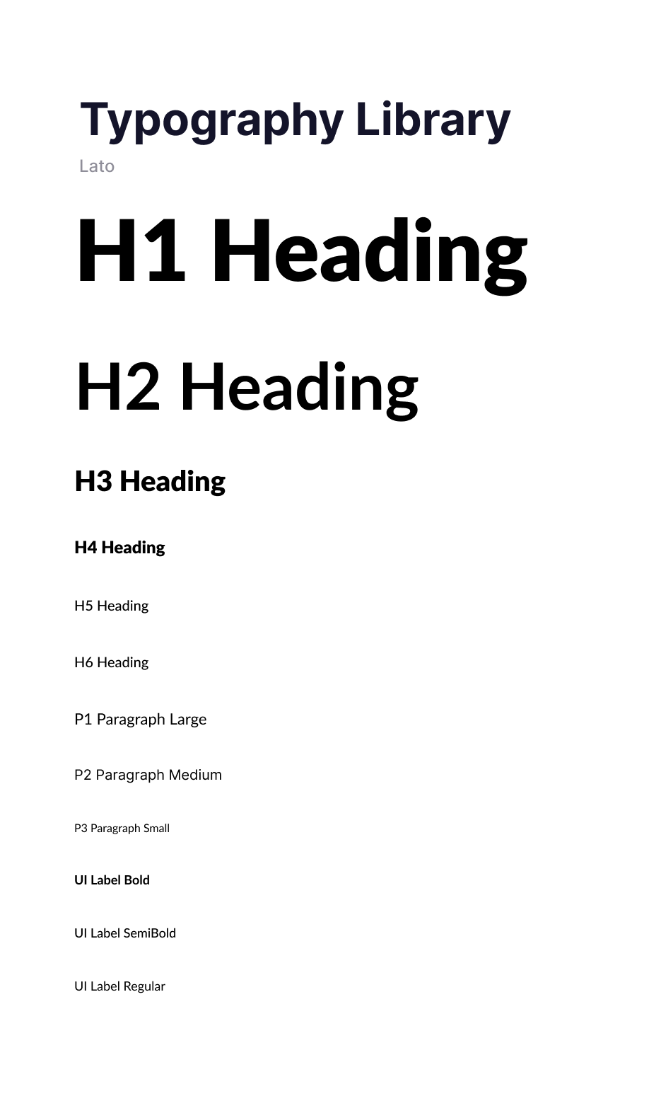
The client had a specific font in mind that they wanted to use across the website. They felt that this font better represented their brand identity and would improve the overall visual appeal. As a result, I needed to update the typography to align with their preference.

Proper Information Listing:

Users appreciated having all relevant information listed properlhout any hassle.

architecture Mockups

Mockups: Original screen size

Once the wireframes were finalized and approved by the client, I moved on to creating high-fidelity prototypes. These prototypes incorporated the client's feedback and showcased the final design, including colors, typography, and interactive elements.

Digital wirefrmae
Digital wirefrmae Digital wirefrmae Digital wirefrmae

all_inclusive All Inclusive

Accessibility considerations

Clear Visual Hierarchy:

I used headings of different sizes to create a clear visual hierarchy, making it easier for users to scan and understand the content.

Section Division:

The landing page was divided into sections, allowing users to navigate easily and find the information they needed without confusion.

Alt Text:

All images were provided with alt text, ensuring that screen readers could effectively interpret and convey the content to visually impaired users.

cognition Takeaway

task_alt Impact:

The project successfully delivered a modern, user-friendly website that aligned with the client’s brand and highlighted their services. The responsive design ensured that users could access the site on various devices, enhancing the overall user experience.

auto_stories What I learned:

Working within the constraints of a complex color palette taught me the importance of flexibility and creativity in design. Also Conducting thorough user research and usability studies emphasized the importance of understanding user needs and preferences in creating effective designs and Regular communication and feedback from the client were crucial in refining the design and ensuring it met their expectations and requirements.

Thank You

Thank you for your interest in this project. If you have any questions or would like to see more of my work, please feel free to contact me.


contract Transforming Rival Sports Gym Pain and Rehab

contract Project Overview

Rival Sports Gym Pain and Rehab, a well-established provider of gym facilities, expanded its services to include rehabilitation for individuals suffering from joint and muscle pain. They needed a modern, user-friendly landing page to effectively communicate their new offerings and attract their target audience. This project involved redesigning the website to reflect these changes, ensuring it resonated with both existing and potential clients.​

brightness_alert The Problem

The existing website was primarily designed for gym services and lacked the necessary focus on rehabilitation. It was outdated, not user-friendly, and failed to effectively communicate the new range of services. Additionally, existing customers might find it challenging to transition to the new layout, which required careful consideration in the design process.

award_star The Goal

The primary goal was to create a modern, engaging, and user-friendly landing page that effectively communicated Rival Sports Gym Pain and Rehab's expanded services. The design aimed to resonate with the target audience, ensuring easy navigation and access to vital information, while addressing the needs of both new and existing customers.

assignment_ind My role

  • Regularly liaised with the client to understand their vision, requirements, and feedback, ensuring the design aligned with their expectations.
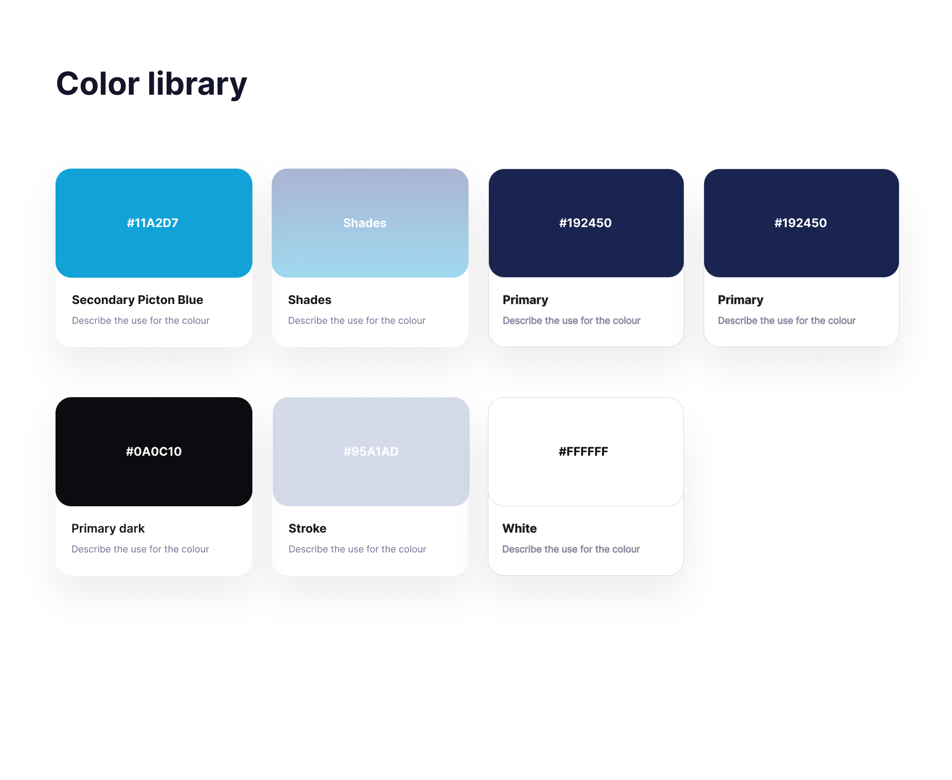
  • Developed a modern and appealing color palette that aligned with the brand identity and enhanced user experience.
  • Conducted thorough research to understand the needs and preferences of the target audience, informing design decisions.
  • Created wireframes and prototypes to establish a suitable layout that was both intuitive and visually appealing.

task_alt Responsabilities

  • UX Copywriting
  • Design Execution
  • Usability Testing
  • Ensuring accessibility
  • Refining the design

person_search User Research:

Summary

The user research involved understanding the target audience, primarily individuals seeking relief from joint and muscle pain through rehabilitation services. We analyzed competitor websites, surveyed potential users, and conducted interviews to gather insights. Key findings included the need for clear, accessible information on services, ease of navigation, and visual appeal to instill trust and professionalism.

Pain points

Outdated Design:

The existing website design was not visually appealing and failed to convey professionalism.

Poor Navigation:

Users found it difficult to navigate the site and locate relevant information quickly.

Lack of Focus on Rehabilitation:

The old website was gym-centric and did not effectively highlight the new rehabilitation services.

User Transition:

Existing customers might struggle to adapt to the new layout without a seamless transition strategy.

draw Scketches and Wireframes

Paper Wireframes

To find the right layout, I started with sketches and paper wireframes. This allowed for quick iteration and experimentation with different design elements. The goal was to create an intuitive layout that emphasized key sections like the hero banner, about us, services, and contact information.

wirefrmae

Layouts

The digital wireframe laid out the fundamental structure of the landing page, ensuring a clean, organized layout. Key sections included the header, hero section, service highlights, about us, testimonials, contact information, and an interactive map. Each section was clearly defined to ensure easy navigation and accessibility.

Hero Section:

Captivating banner with a clear CTA.

About Us Section:

Overview of the company and its mission.

Contact Us:

Easy access to contact information and CTAs.

Conditions We Treat:

List of conditions treated by the provider.

Experts/Doctors:

Profiles of doctors and their specializations.

Latest Blogs:

Insights and updates related to rehabilitation.

FAQs:

Addressing common queries to assist users.

Client review

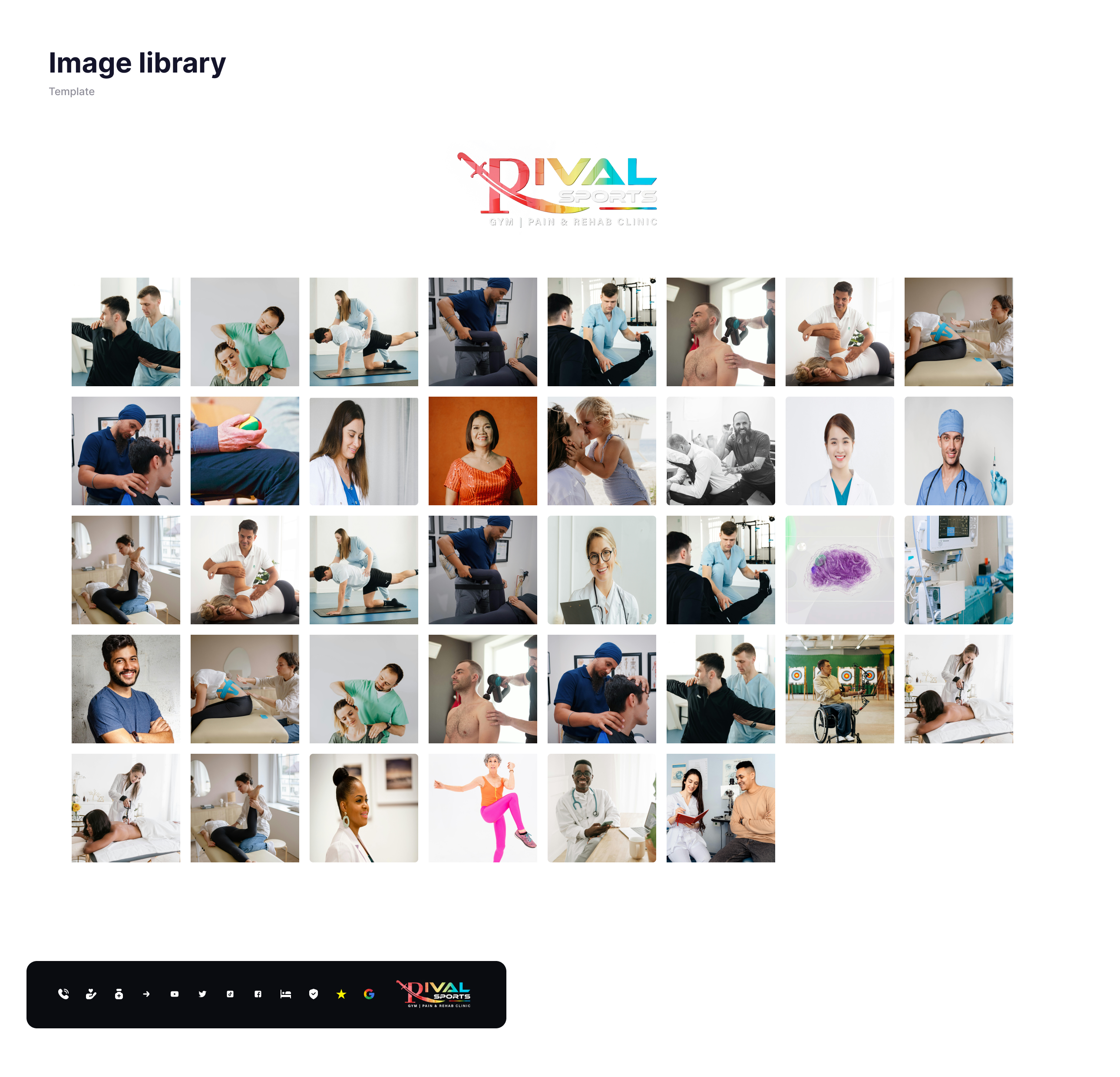
The client was very satisfied with the overall project, appreciating the modern design and intuitive layout. They requested changes for more contrast between the background and action colors, opting for a very dark blue. Additionally, they asked to replace the hero section image of a smiling doctor with one of a professional performing chiropractic services. These changes were promptly made to align with the client’s vision.

architecture Mockups

Mockups: Original screen size

The high-fidelity prototype showcased the final design, complete with interactive elements and a polished visual style. It was created using Figma and included detailed annotations to guide the development process.

Digital wirefrmae
Digital wirefrmae Digital wirefrmae Digital wirefrmae

all_inclusive All Inclusive

Accessibility considerations

Color Contrast:

Ensured sufficient contrast between text and background for readability.

Alt Text:

Added descriptive alt text to all images for screen readers.

Keyboard Navigation:

Ensured the site could be navigated using a keyboard.

cognition Takeaway

task_alt Impact:

This project reinforced the importance of thorough research and user-centered design. It demonstrated how a well-executed UX strategy can transform a website, improving user engagement and satisfaction. For the users, the new design provided an intuitive, visually appealing platform to access vital information and services, enhancing their overall experience.

auto_stories What I learned:

Through this project, I learned the critical importance of thorough user research and the value of client collaboration. Adapting to challenges and being flexible in the design process were key to meeting project goals. Emphasizing accessibility and attention to detail ensured a user-friendly and inclusive design. Overall, balancing aesthetics with functionality and maintaining a user-centered approach were pivotal in creating an effective and engaging landing page.

Thank You

Thank you for your interest in this project. If you have any questions or would like to see more of my work, please feel free to contact me.